What’s New

Keep up with the latest releases, improvements, and fixes.

See what’s planned

Save now, finish later

Long forms don't have to mean lost progress. With Save & resume switched on, your respondents get a floating Save & come back later button while they fill in the form.

One click saves their answers and hands them a private link. Open it any time — on the same device or a different one — and the form picks up exactly where they left off, right down to the page they were on. Once they submit, the link is spent, so it can't be reused.

To turn it on: open your form, go to SettingsForm, and flip the Save & resume toggle. That's it — the button appears on the published form. It works on multi-page forms, with conditional logic, and on your custom domain.

Also new in this release — clickable links. Highlight any text in a question title or description, hit the new Link button in the text toolbar, and paste a URL. Point respondents to your privacy policy, terms, or a help article without cluttering the question. Links open in a new tab and work everywhere your form does.

Conditional logic is here

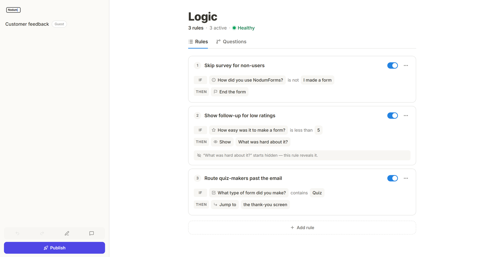
The new Logic page in the builder showing three rule cards — “Skip survey for non-users”, “Show follow-up for low ratings”, and “Route quiz-makers past the email” — each with IF condition chips, a THEN action, and an on/off toggle, under a header reading 3 rules · 3 active · Healthy.

Your forms can finally think. The new Logic tab in the builder lets you write rules in plain English — if the rating is less than 5, show the follow-up question. Show or hide questions, jump past pages, or end the form early based on what people answer.

The pickers adapt to each question type, conditions combine with AND / OR, and rules re-evaluate live as your respondents answer — even within the same page. A built-in health check flags conflicts, questions that can never appear, and backwards jumps before anyone else sees them.

The Questions view flips the lens: every question, its starting visibility, and each rule that touches it, grouped page by page. And if you skip naming a rule, one is written for you automatically.

Forms that fit their content

Graphic placeholder
Product screenshot for the "resizable-form-width" release
16/9
↳ drop file at /graphics/release-resizable-form-width.html

Every form used to sit at one fixed width. Now you can grab the handle on either edge and drag — a tight, focused form for a quick question, or a wide canvas for something with more going on. Anywhere from 320px to 1200px.

The width you set is the width people see. It rides along to the published form and comes with you when you duplicate. Small thing, big difference.

NodumForms on your phone

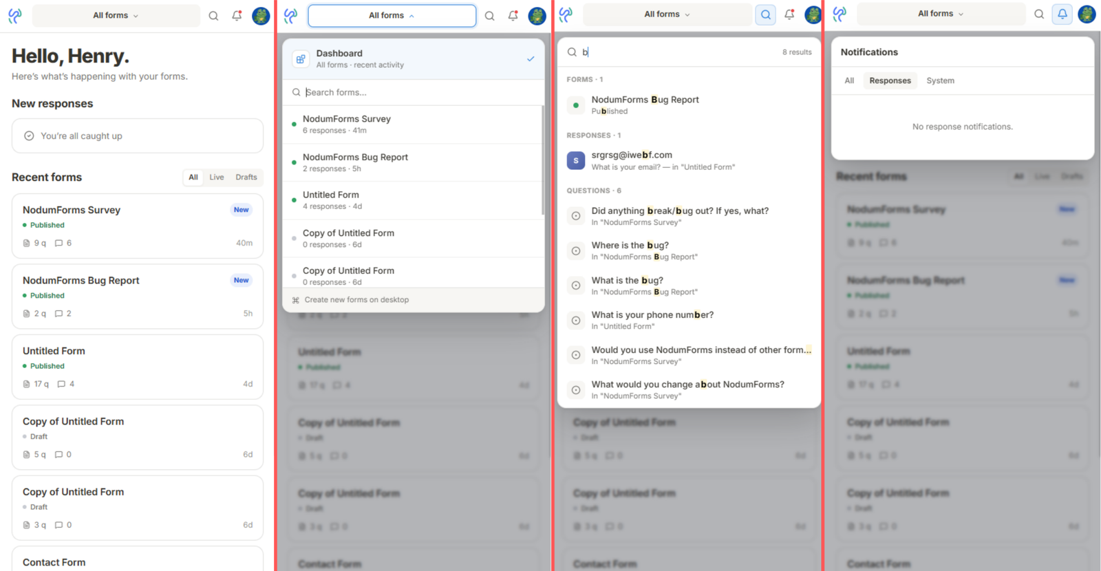
Phone-frame screenshot of the new mobile dashboard: sticky topbar (brand → form picker → search → bell → avatar), a “New responses” preview card up top, and a “Recent forms” list with All / Live / Drafts tabs below.

The hamburger drawer is out. A sleek sticky topbar takes its place — brand mark, form picker, search, bell, avatar — with overlays that drop down right where you'd expect them.

The dashboard has a new mobile home with a fresh responses preview and your recent forms filtered by All, Live, or Drafts. Summary, Individual, and Table views all work natively now — no more “open on desktop” warnings.

Building a form still needs desktop. Squeezing a block menu onto a phone is next on the list.

A cleaner builder layout

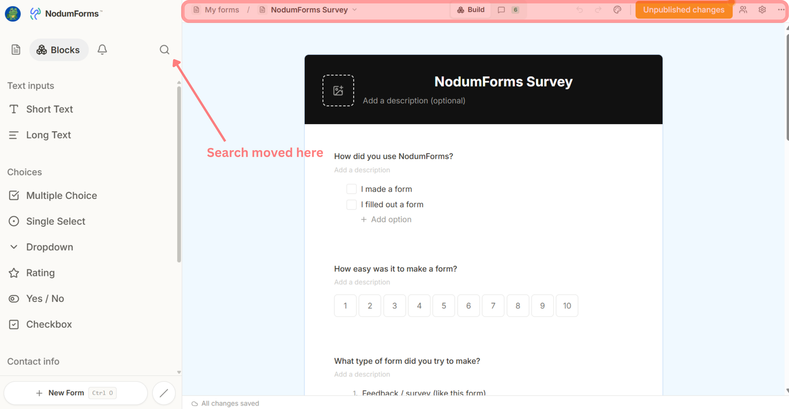
Builder with the redesigned chrome: slim topbar showing avatar + NodumForms logo on the left, breadcrumb (My forms / form name with a dropdown chevron), a centred Build / Responses pill with a response count, then undo / redo / style / Published button / collaborators / settings / more on the right. Left sidebar shows the new Blocks / Notifications / Search tabs and the block library grouped by category, with “+ New Form” pinned to the bottom.

The whole builder chrome got a tidy-up. The topbar is slim and purposeful — breadcrumb on the left, a Build / Responses pill in the middle (with a live response count), and everything you actually act on (undo / redo / style / Published / collaborators / settings) on the right.

The left sidebar gets new tabs — Blocks, Notifications, Search — and the block library is grouped into Text inputs, Choices, Contact info, and more. + New Form is pinned to the bottom for quick reach.

On the Responses page, the middle tab is now Questions — a per-block list with response counts. Click any question to drill into its detail view.

One question at a time

Graphic placeholder
Product screenshot for the "question-detail-drill-down" release
16/9
↳ drop file at /graphics/release-question-detail-drill-down.html

Click any question on the Responses page and you land on a dedicated detail view: the summary chart up top, every answer to that one question below.

Search, sort, and filter across thousands of submissions to find the specific answer you're after. Use J / K to flip to the previous or next question without leaving the page.

Find anything with ⌘K

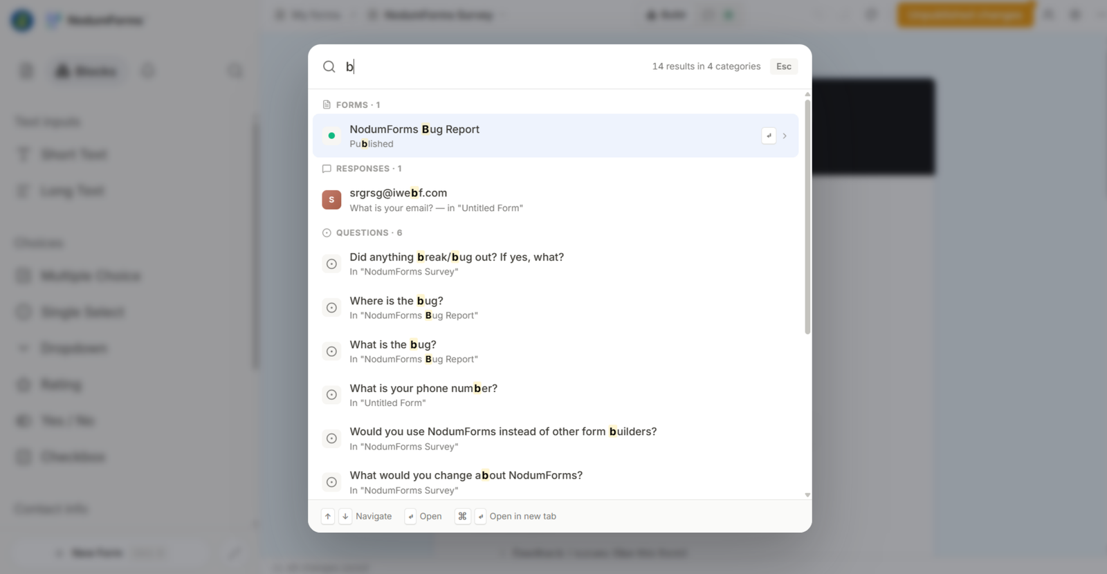
Centred ⌘K search modal open over a dimmed app background, with a query typed in and results grouped into sections — Forms, Responses, Questions, Actions — and match highlighting on each row.

Hit ⌘K from anywhere in the app and search across forms, responses, questions, and actions in one place. Full keyboard nav: ↑↓ to move, to open, ⌘↵ to open in a new tab.

Want to narrow it down? Type /forms, /responses, /questions, or /actions to filter by type.

Version history and shared Styles

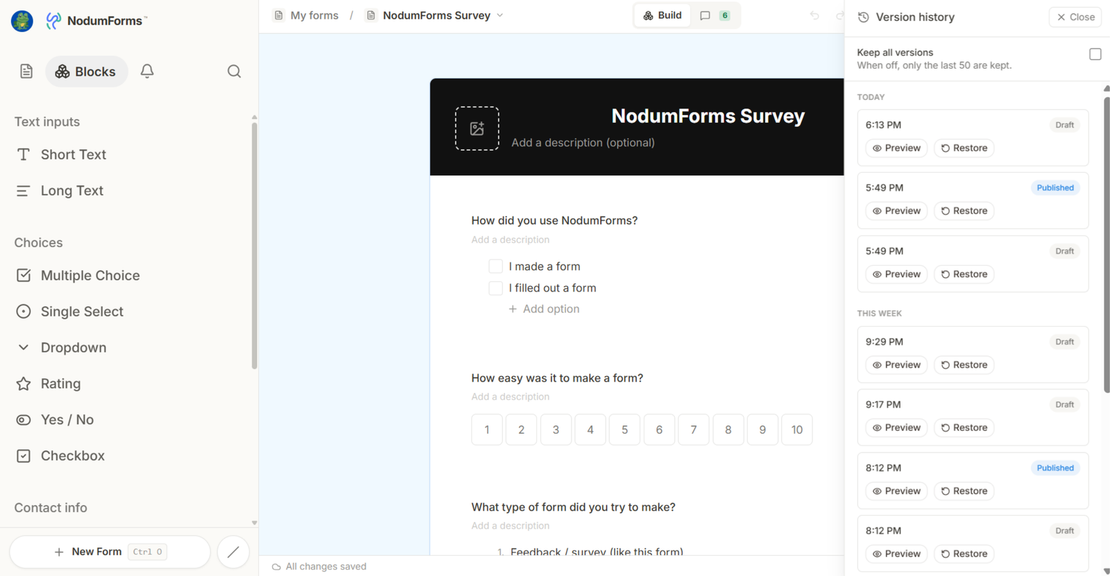
Builder with the Version History panel open on the right, showing a chronological list of snapshots with timestamps, the person who saved each one, and a Restore button on the highlighted version.
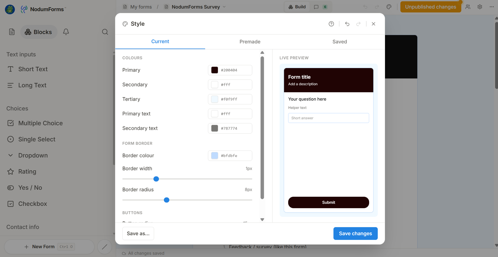
The Style modal open in the builder, showing a row of premade themes at the top and a custom palette editor below with the 5 colour swatches (primary, background, surface, text, accent) and a “Share Style” link button.

Every form now keeps a running history of snapshots. Open the Version History panel to browse past versions, preview any of them in place, and restore with one click.

Styles are new too. Pick a premade theme, build your own 5-colour palette, or save a Style and share it across forms with a public link.

New builders get a quick banner explaining how Styles work. Existing forms get a sensible default on first load.

Build forms together

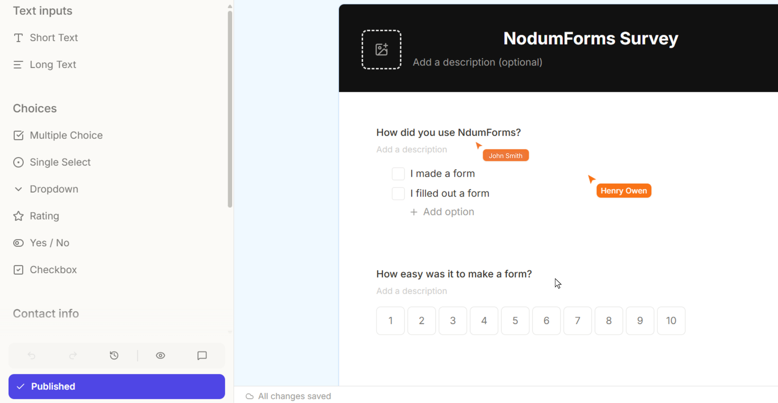
Sidebar showing the Invite popover on a form, with the new “Shared with me” section visible below. The Alerts tab has an unread badge on the bell icon.

Forms are no longer a solo sport. Hover a form in the sidebar, click Invite, and send a request to anyone with a NodumForms account. Invitations arrive by email and in-app at the same time.

Shared forms show up under a new Shared with me section on the dashboard. Or generate a public edit link — anyone with the link can edit without an account.

Also new: an in-app notifications inbox. Get an alert in the Alerts tab the moment a new response comes in, with an unread badge on the bell.